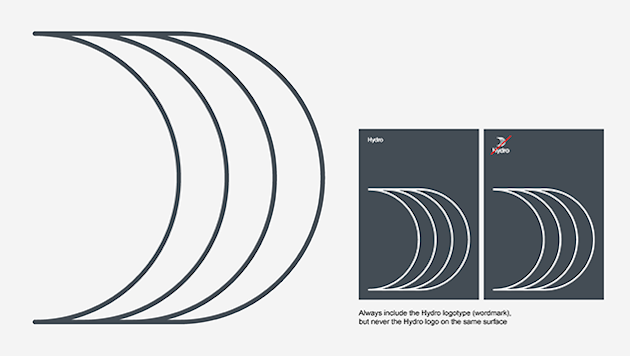
Referred to as The Sail, it will further enhance brand recognition, but should be used sparingly and thoughtfully so as to not compete with our primary brand signature - the Hydro logo.
The sail must only be used once on any one surface or multipage publication, and must always be accompanied by our logotype (word mark only) on the same surface, as shown in the illustration below. The only exception to the latter is when The Sail fills the entire format (square formats only).This is included in all relevant template files. Never place the Hydro logo on the same surface as the key visual.
It is extremely important to note that The Sail is provided as a set of separate EPS files. Never extract the brand mark from the Hydro logo and use this as the key visual - it will appear too bulky.
Versions
These are the official versions of The Sail. No other arrangement or color is allowed.

You are free to choose the version that works best for your specific project. The dark blue provides a distinct presence on light backgrounds, while aluminium is more subtle. Aluminium is preferred in premium printed matter where it maybe reproduced in metallic Pantone 877 or matte silver foil.
The white (negative) version of The Sail is intended for dark backgrounds. If The Sail cannot be reproduced in color, use the black, white, or aluminium (CMYK) version. Never convert the dark blue sail to grayscale.
Scale and placement / misuse
 The Sail should always be scaled to cover the entire width (vertical formats) or height (horizontal formats) of the margins. The placement is dictated by the other elements on the surface, as the illustrations show. As with our logo, you must never distort or modify The Sail in any way.
The examples showing misuse of the Hydro logo also apply to our key visual element.
Updated: 11 July 2024